
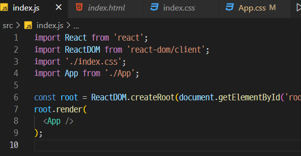
폰트 설정
Google Fonts
Making the web more beautiful, fast, and open through great typography
fonts.google.com
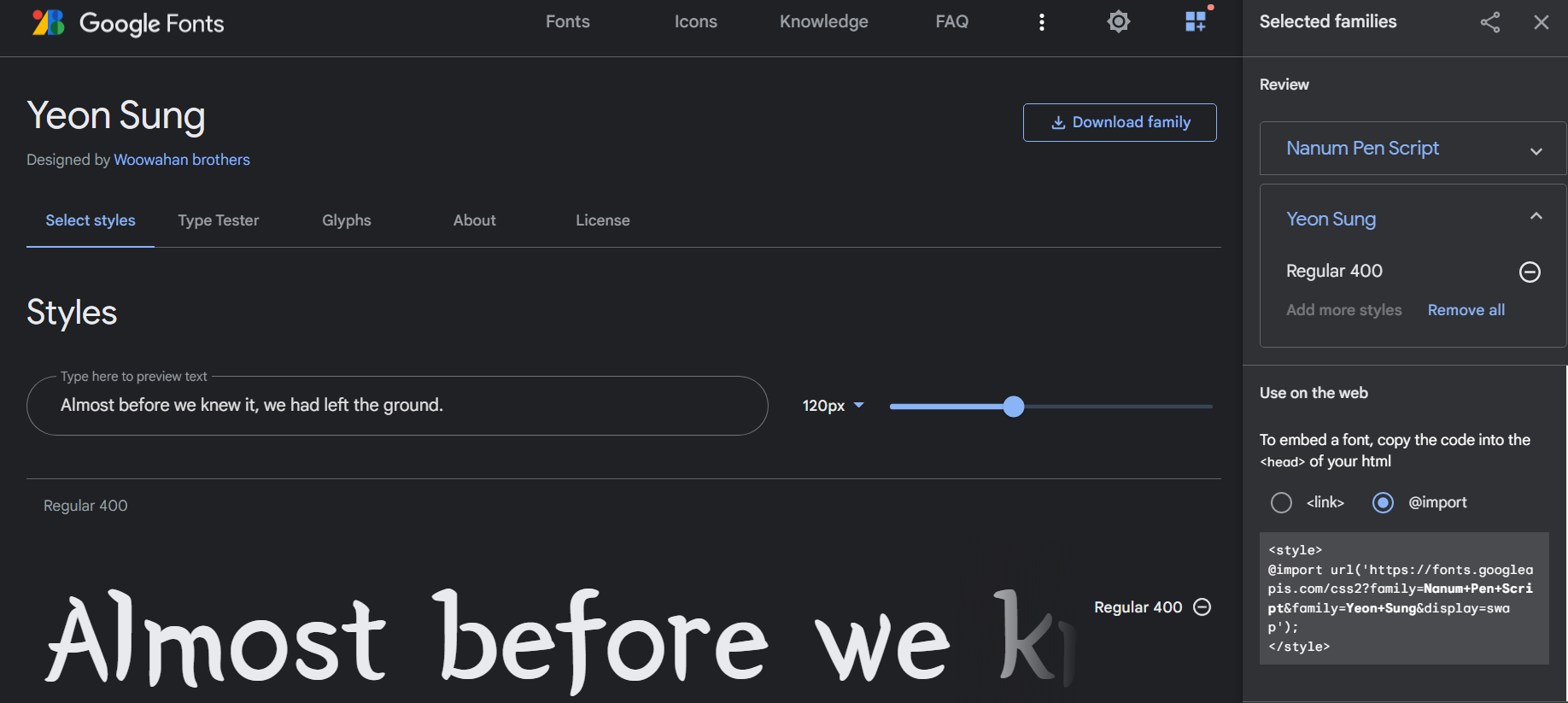
구글폰트에 있는 나눔펜스크립트와 연성폰트를 사용한다
import style 내 url과 css font-family를
App.css에 등록해줬다
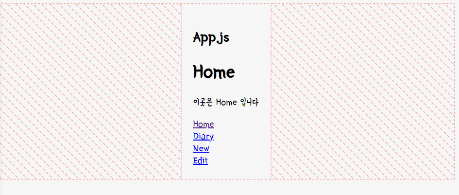
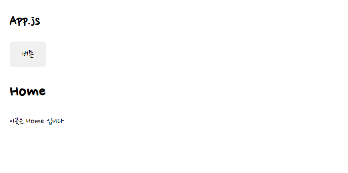
레이아웃 셋팅
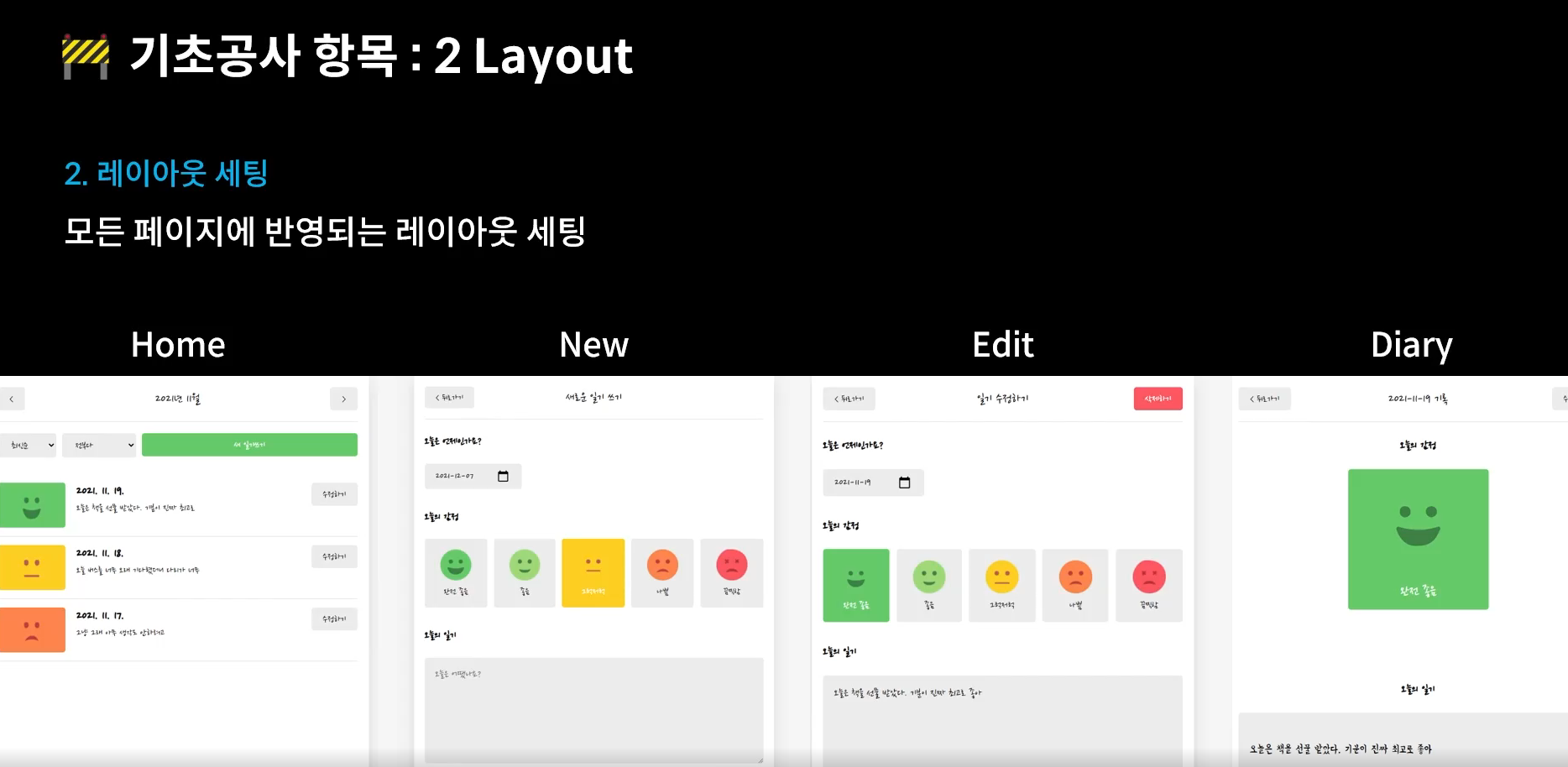
모든 페이지에 반영되는 레이아웃 셋팅을 할 것이다.
흰색 메인 컨텐츠, 바탕 회색등의 모든 페이지에 공통되는 스타일을 추가할 것
React 앱은 index.js파일에서 앱 컴포넌트가 랜더링되는 JSX요소들을 아이디가 루트를 갖는 요소를 자식으로 가지면서(getElementById('root') 화면에 추가되는 원리.
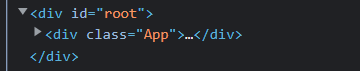
그 증거로 요소 확인시 App컴포넌트는 root 디비전 안에 들어있다.
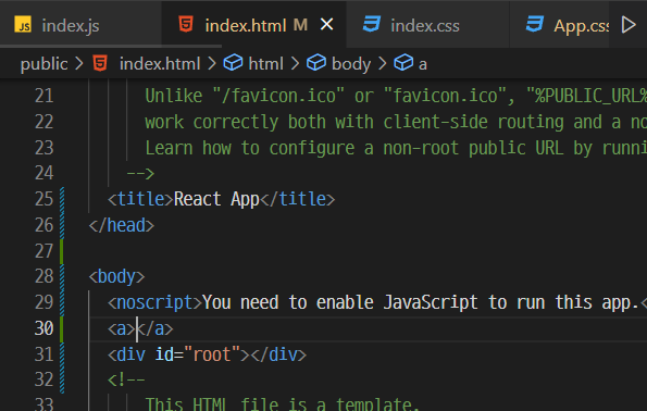
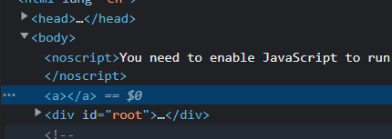
만약 index.html에서 root 위에 다른 태그를 적어주면 ? 이런식으로 root위에 a 속성이 생긴걸 확인 할 수 있다
그렇기 때문에 App컴포넌트에 css를 주는게 아닌
전체적용될 곳은 body에 속성을 줄것이다
align-item >> display가 flex속성으로 있을 때 세로축 기준으로 가운데로 주겠다.
justify-content >> display가 flex속성으로 있을 때 가로축 기준으로 가운데로 주겠다.
100vh >> view port height 웹 스크린 실제크기의 100%를 최소높이로 갖겠다
기본 마진은 0으로 없애주었다
그리고 반응형을 위해 media 사용 @media (min-width: 650px) >> 최소 너비가 650이상일 때 적용되는 css
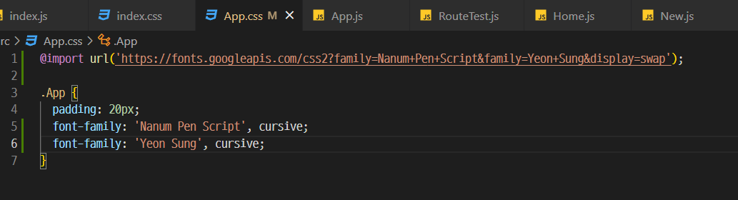
@import url('https://fonts.googleapis.com/css2?family=Nanum+Pen+Script&family=Yeon+Sung&display=swap');
body {
background-color: #f6f6f6;
display: flex;
justify-content: center;
align-items: center;
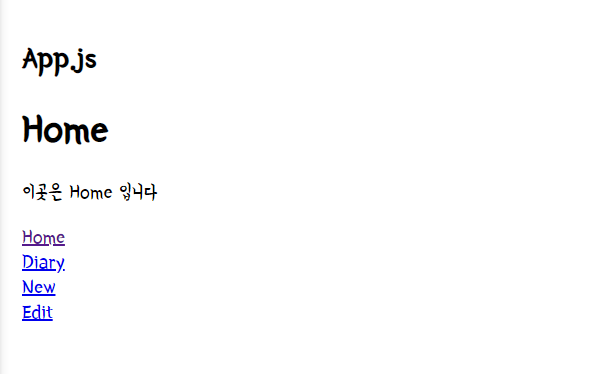
font-family: 'Nanum Pen Script';
min-height: 100vh;
margin: 0px;
}
@media (min-width: 650px) {
.App {
width: 640px;
}
}
@media (max-width: 650px) {
.App {
width: 90vw;
}
}
#root {
background-color: white;
box-shadow: rgba(100, 100, 111, 0.2) 0px 7px 29px 0px;
}
.App {
min-height: 100vh;
padding: 0px 20px;
}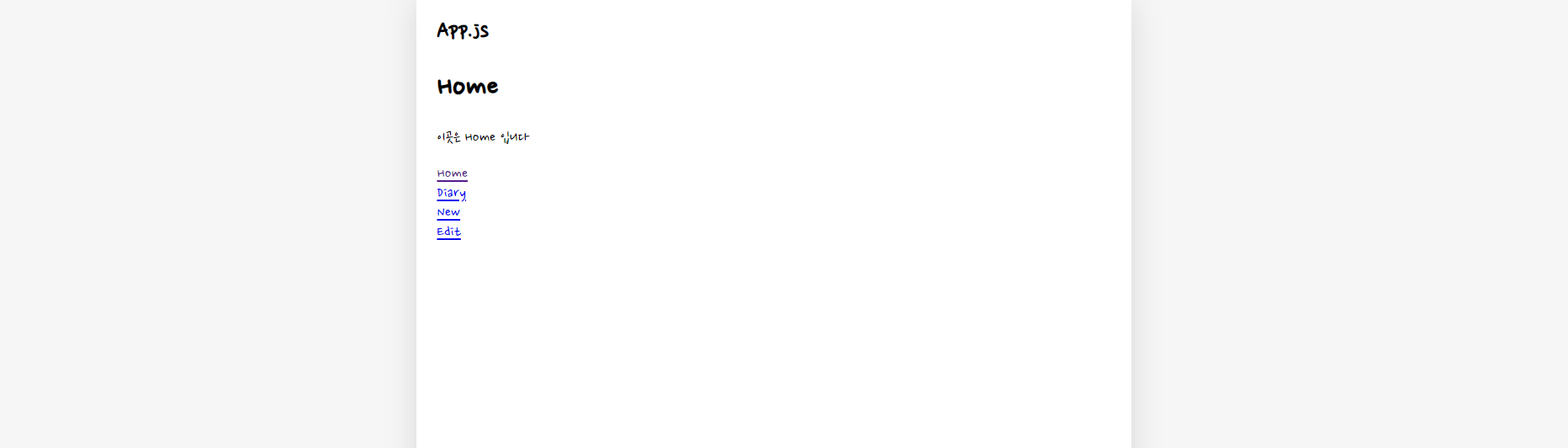
이런식으로 컨텐츠 배경은 흰색, 은은한 그림자 효과를 주었다.
Image Assets
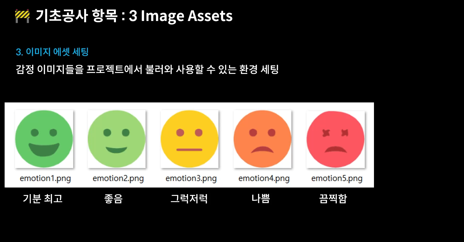
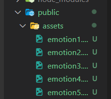
다운로드 한 이미지들을 assets 밑으로 넣어준다.
<img src={process.env.PUBLIC_URL + `/assets/emotion1.png`}/>앱 컴포넌트 리턴 안에 img 를 불러올 수 있도록
process.env.PUBLIC_URL >> public경로를 가리킴

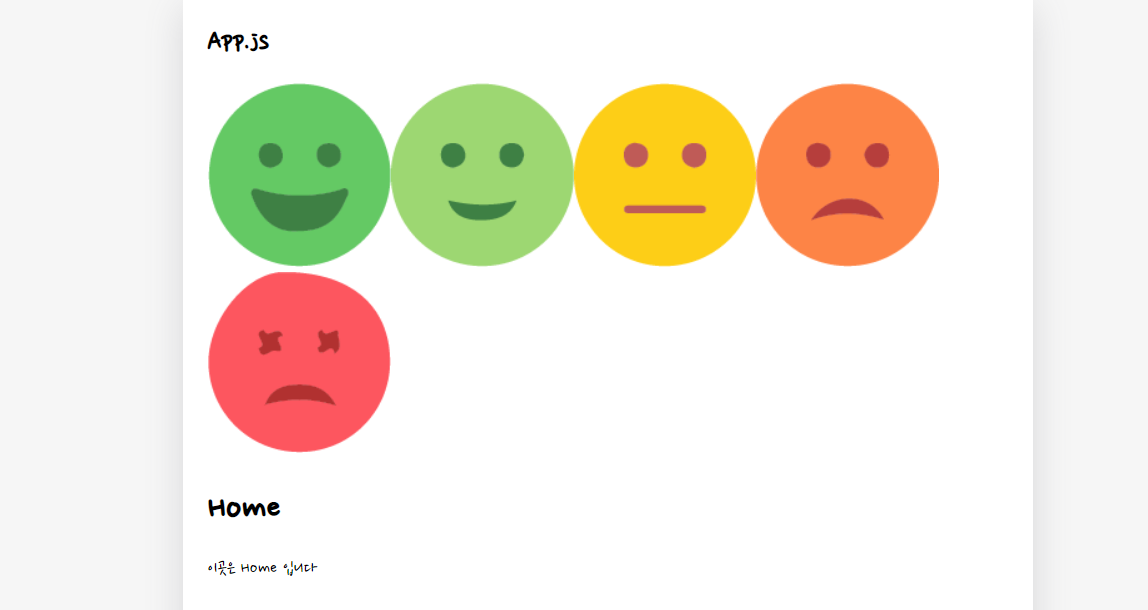
내가 추가 한 이미지가 잘 나오는지 확인 한 후 다시 지워줬다.
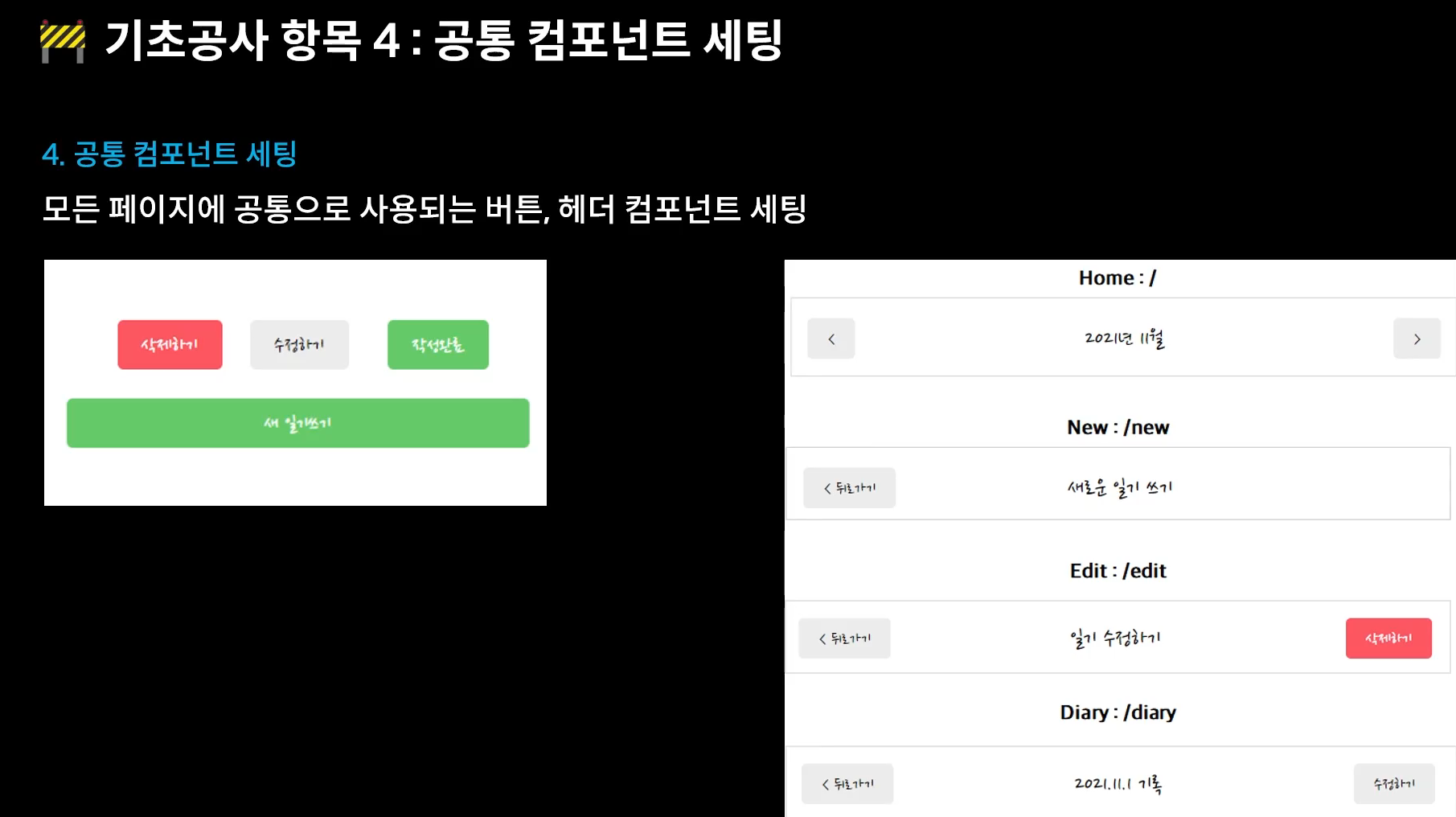
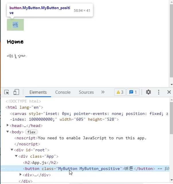
공통 컴포넌트 세팅 > > 버튼, 헤더
const Mybutton = ({ text, type, onClick }) => {
    return (
        <button className={"MyButton"} onClick={onClick}>
            {text}
        </button>
    )
}

export default Mybutton;
버튼을 위해 받아 올 text, type, onClick이 담긴 Mybutton 컴포넌트를 만들어주었다
클래스는 항상 컴포넌트와 같은 이름으로 지정해준다.
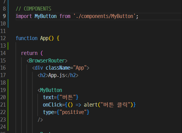
앱컴포넌트에 MyButton 컴포넌트를 추가하고 alert 이벤트를 주었다.
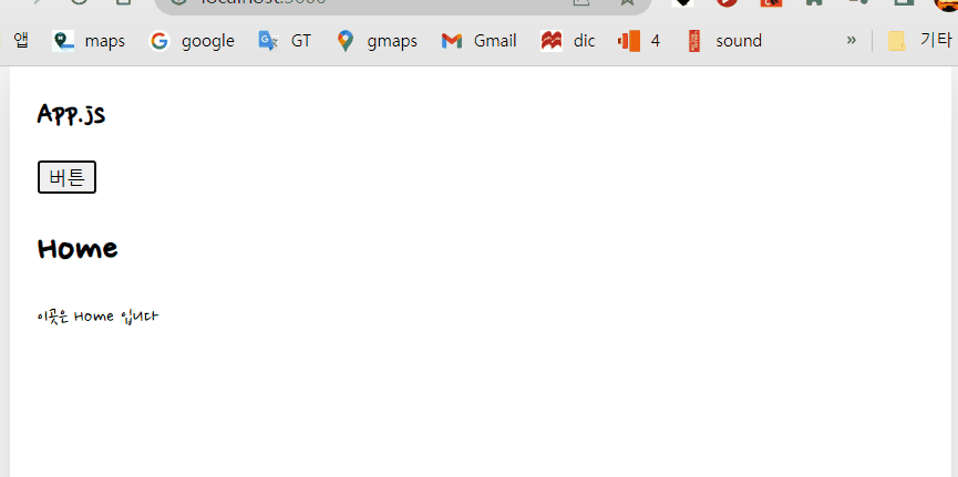
허전한 버튼에 css를 추가해준다
/* MyButton */
.MyButton {
  cursor: pointer;
  border: none;
  border-radius: 5px;

  padding: 10px, 20px;

  font-size: 18px;

  white-space: nowrap;
  font-family: 'Nanum Pen Script';
}
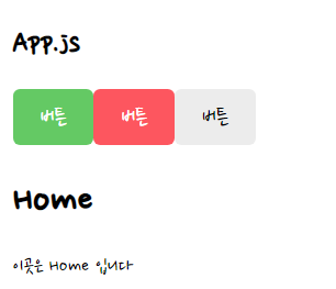
버튼을 type 프롭에 따라 변화주기
const MyButton = ({ text, type, onClick }) => {

    const btnType = ['positive', 'negative'].includes(type ? type : 'default');

    return (
        <button
            className={["MyButton", `MyButton_${type}`].join(" ")}
            onClick={onClick}
        >
            {text}
        </button>
    )
}

MyButton.defaultProps = {
    type: "default"
}

export default MyButton;
아무 버튼이나 생성되지않게 const, 삼항연산자로 막아주고,
클래스네임을 배열로 전달하면 안되기때문에 join을 사용해서 MyButton_과 동적으로 변하는${type}을 합쳐준다.
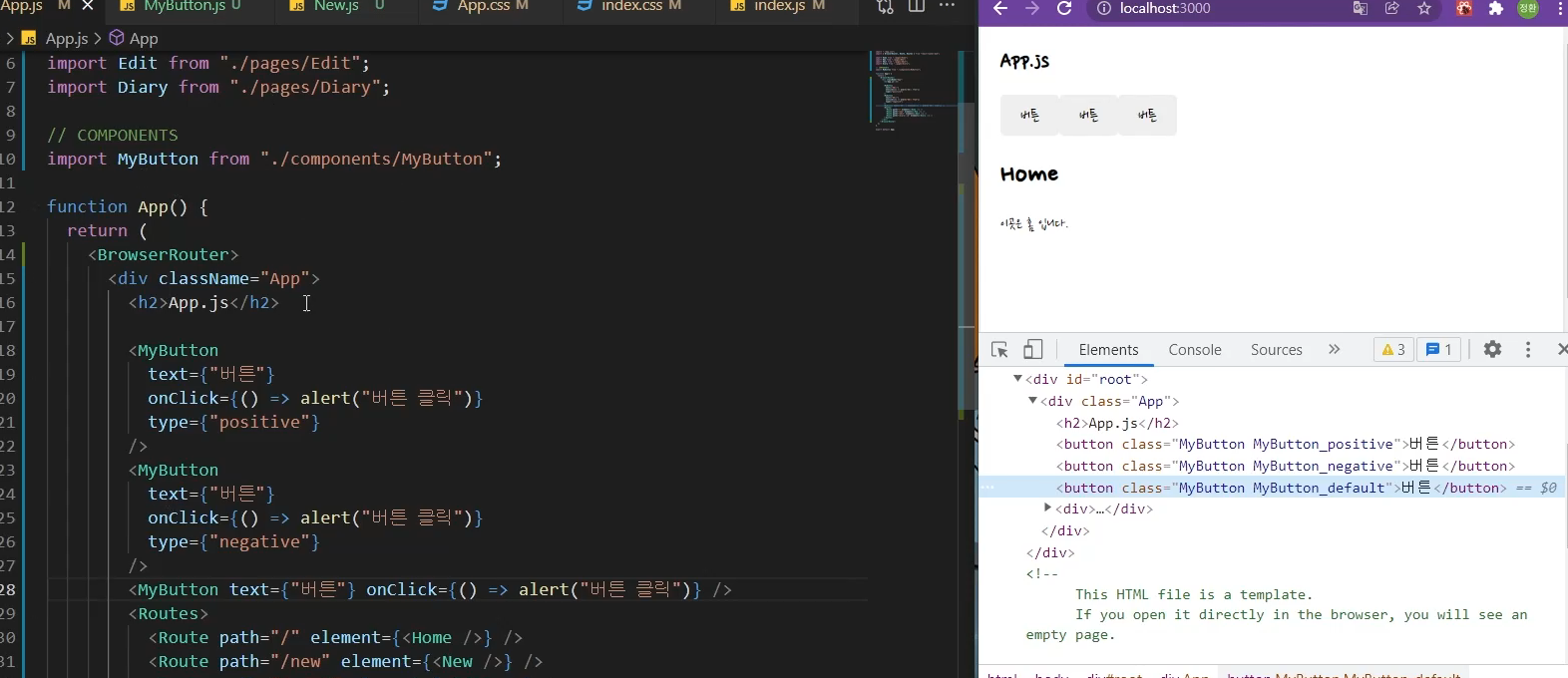
앱컴포넌트에 MyButton 타입을 어떻게 주느냐에 따라 positive가 될 수도 있고 아무것도 적지않으면 default가 된다
이제 App.css에서 각 버튼의 색상을 type prop에 맞게 각각 적용시켜주자
페이지 공통으로 사용될 헤드를 만들어주기
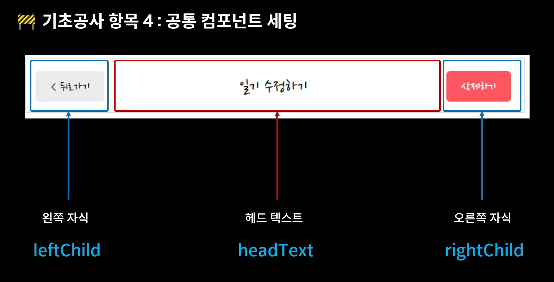
const MyHeader = ({ headText, leftChild, rightChild }) => {
return (
<header>
<div className="head_btn_left"> {leftChild} </div>
<div className="head_text"> {headText} </div>
<div className="head_btn_right"> {rightChild} </div>
</header>
)
}
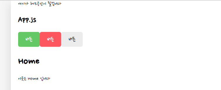
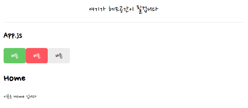
export default MyHeader; <MyHeader headText={"여기가 헤드공간이 될겁니다"} />MyHeader 컴포넌트 생성 후 App 컴포넌트에 추가
/* HEADER */
header {
  padding: 20px 0;
  display: flex;
  align-items: center;
  border-bottom: 1px solid #e2e2e2;
}

header>div {
  display: flex;
}

header .head_text {
  width: 50%;
  font-size: 25px;
  justify-content: center;
}

header .head_btn_left {
  width: 25%;
  justify-content: start;
}

header .head_btn_right {
  width: 25%;
  justify-content: end;
}

header button {
  font-family: 'Nanum Pen Script';
}
디비전 속성은 원래 세로로 쌓이는데 display flex를 사용해서 세로축대신 가로축으로 쌓이게 바꿔주었다.
css적용 후
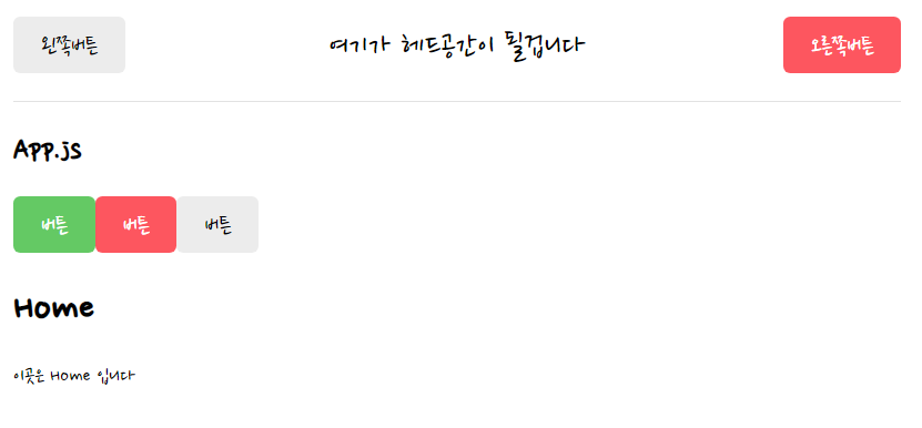
        <MyHeader
          headText={"여기가 헤드공간이 될겁니다"}
          leftChild={<MyButton text={"왼쪽버튼"} onClick={() => alert("왼쪽클릭")} />}
          rightChild={<MyButton text={"오른쪽버튼"} onClick={() => alert("오른쪽클릭")} type={"negative"} />}
        />
앱 컴포넌트에 MyHeader 컴포넌트 좌 우 버튼속성도 MyButton을 사용해 추가해주었다.
참고 :
- 한 입 크기로 잘라먹는 리액트
'개발 > Inafolio' 카테고리의 다른 글
| [React] 미니프로젝트 - 일기장 Home 화면 구현하기 (0) | 2022.08.05 |
|---|---|
| [React] 프로젝트 기초공사하기2 - 상태분리, Provider (0) | 2022.08.03 |
| [혼공단 8기] 4주차 미션 (0) | 2022.07.31 |
| [혼공단 8기] 3주차 미션 (0) | 2022.07.24 |
| [혼공단 8기] 2주차 미션 (0) | 2022.07.14 |